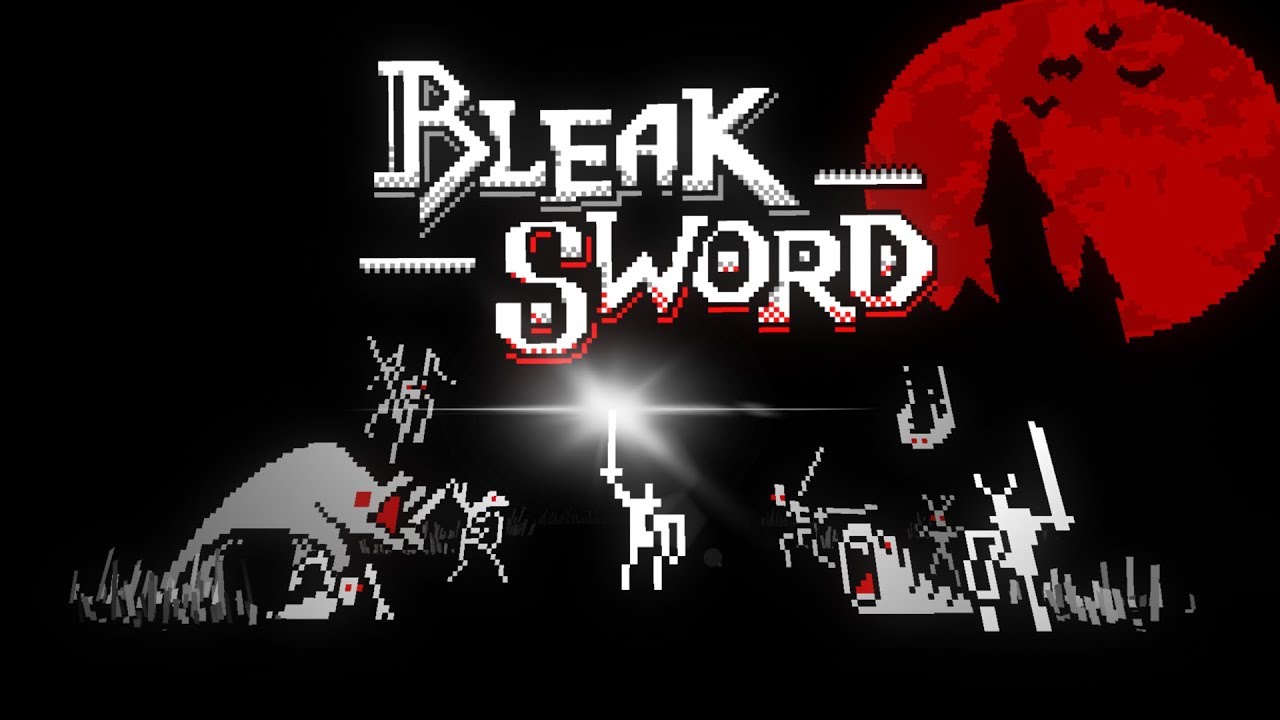
Apple Arcade: ?Bleak Sword? Review ? Someone Finally Figured Out Touchscreen Combat

At first glance, Bleak Sword’s graphics look bad. Really bad. I’m addressing this right out the gate because this first impression has probably kept many players from giving the game a shot. The logo is literally just a stick figure with a sword and shield, for heaven’s sake!
Yes, the low-color sprites are supposed to look retro, and they do look retro. There’s nothing wrong with a retro look, but indie games have been doing the retro look for so long that it’s no longer a novelty. Plus, when you try to look as retro as Bleak Sword is going for, the graphics look bad first and retro second.
It’s a shame that this is the first impression that everyone will get of Bleak Sword, because beneath the bare-bones exterior is some of the best action gameplay that’s ever been imagined for mobile platforms. The plot is about as bog standard as RPG plots get — there’s an evil immortal king, three magic stones, and prophesied hero, so go kill the bad things. It’s all told with a sense of foreboding and gravitas that feels a bit out of place at first. The slideshow cinematic that sets up the plot tells its classic tale of betrayal and woe using stick figures, and it’s hard to get invested in the fate of a kingdom when your first impression of a place is that it’s drawn by a five-year-old.
Yet the game pulls off something tricky as it shuttles players through its multiple various decaying, monster-filled environ...
| -------------------------------- |
| Bless Unleashed - Play FREE Now! |
|
|
-------------------------------------
|
|
|
|
