'Magic Mansion' Review - Monochrome Monotony

If your game is going to be based on an endless principle, it better have a good hook. I'm not thinking narrowly in terms of unlocks, but a fundamental design philosophy that encourages the player to keep chipping away at their high score. A compelling art style and a responsive control scheme help, as endless games are generally great in quick spurts, and not with long marathon sessions.
Nitrome is generally in a class of its own with this, particularly in the freemium circle. They somehow manage to mix up their art style with just about every release, and their approach to each game uniquely fits the mobile space. But with their latest offering of Magic Mansion [Free], a few of their typical pieces of the formula are askew.
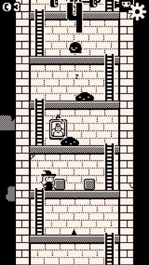
Magic Mansion's intentions make themselves known almost immediately. Like many Nitrome games it brings back memories of a bygone 8-bit era, complete with detailed sprite work that looks like something straight out of a Nintendo project -- albeit with its own look and feel. Magic Mansion dials it a step further too with its monochromatic palette that looks a lot like a Game Boy game. It's a little more pronounced of course, but if you didn't grow up with a certain sense of nostalgia locked away in a special part of your brain, you probably won't have any love for it. Nitrome knows the audience its going for and its commendable in that regard. You can probably take one look at a screenshot and see that there's no on-screen inputs, which would lead to t...
| -------------------------------- |
| Fortnite - Imperial Stormtrooper Announce Trailer | PS4 |
|
|
-------------------------------------
|
|
|
|
